Goal 1

Global Head of User Experience

Tap a slide to open it full size and zoom in.
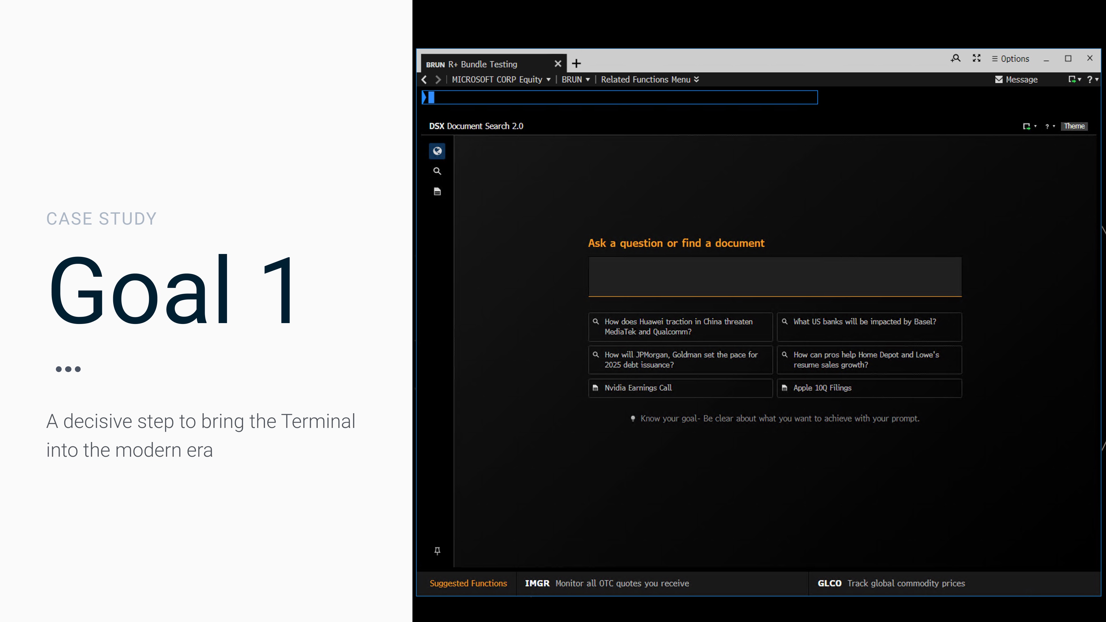
Case study: Goal 1 — a decisive step to bring the Terminal into the modern era. Shown beside the DSX Document Search landing page.

Modernizing the Terminal: jump-starting the evolution of a 40-year-old iconic product. Overview: Goal 1 was an operational reset that aligned UX and Engineering by replacing abstract debate with a one-month, evidence-based demo. Timeframe: 1 month. Shown beside the Bloomberg Anywhere login screen.

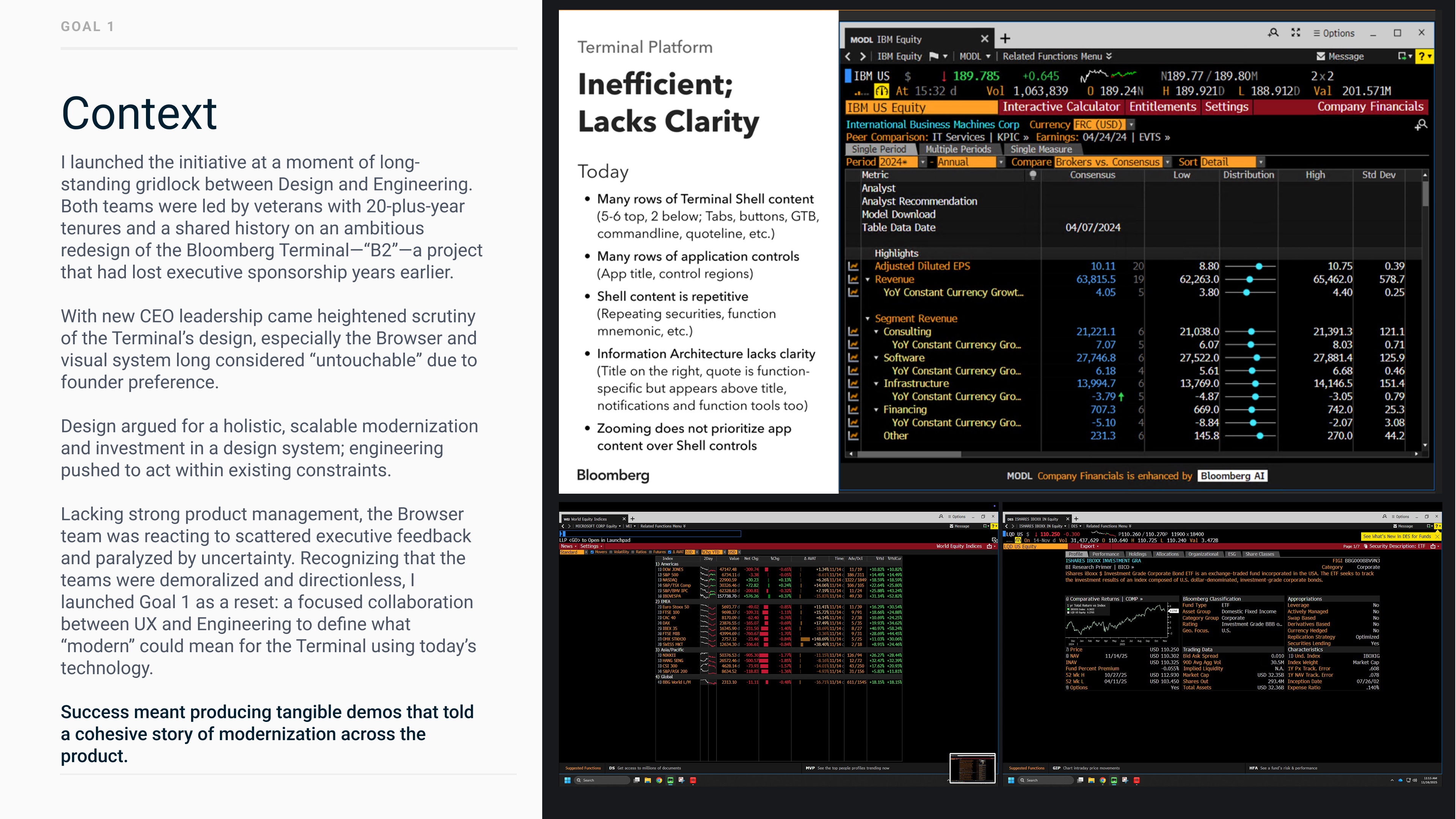
Context: long-standing gridlock between Design and Engineering, heightened CEO scrutiny of the Terminal’s design, and a demoralized Browser team. I launched Goal 1 as a reset to define what “modern” could mean using today’s technology. Shown with a slide titled “Terminal Platform: Inefficient; Lacks Clarity” and two screenshots of the old Terminal browser.

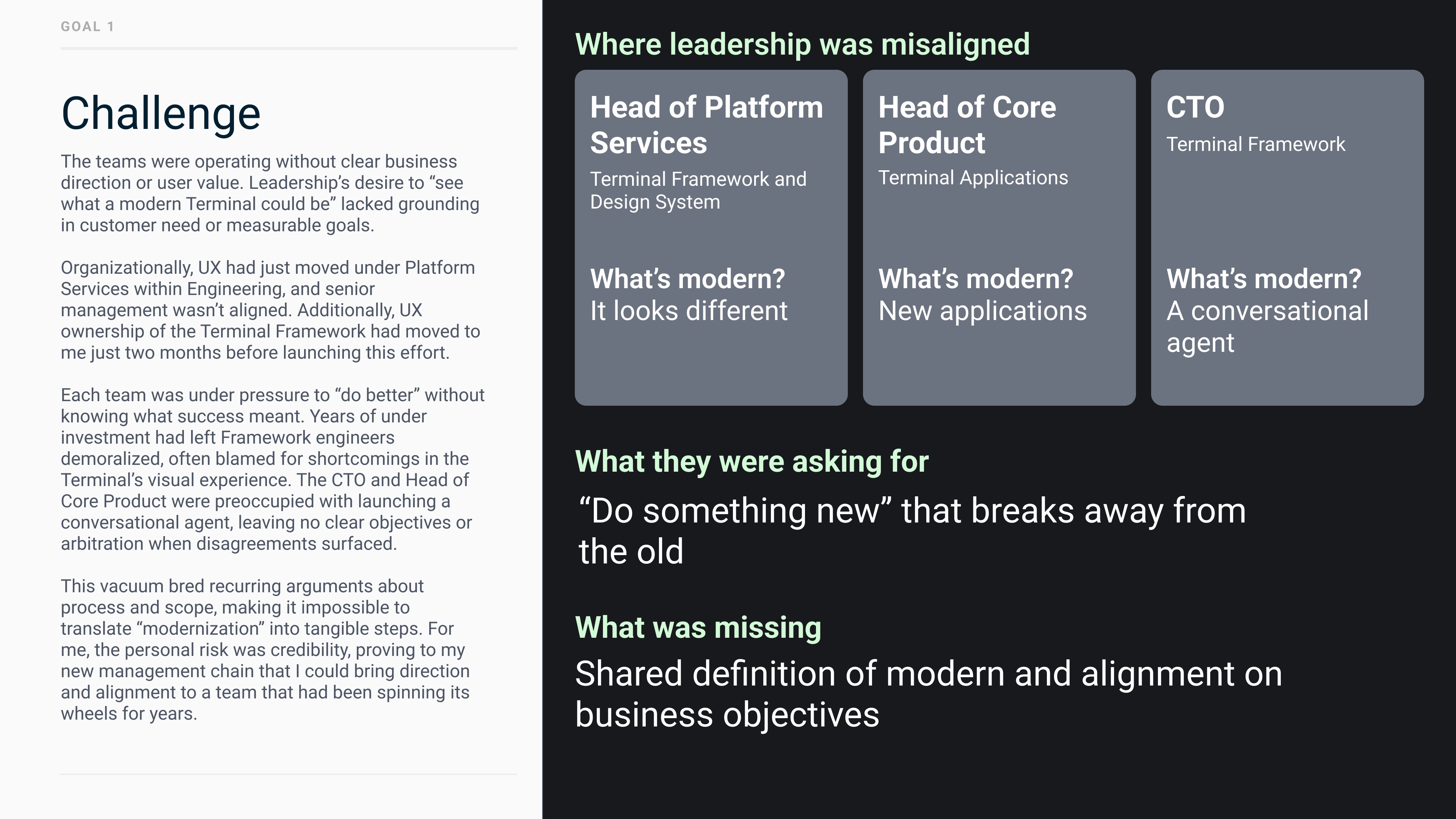
Challenge: teams lacked clear business direction and leadership was misaligned. Head of Platform Services: modern means it looks different. Head of Core Product: new applications. CTO: a conversational agent. They asked to “do something new”; what was missing was a shared definition of modern and alignment on business objectives.

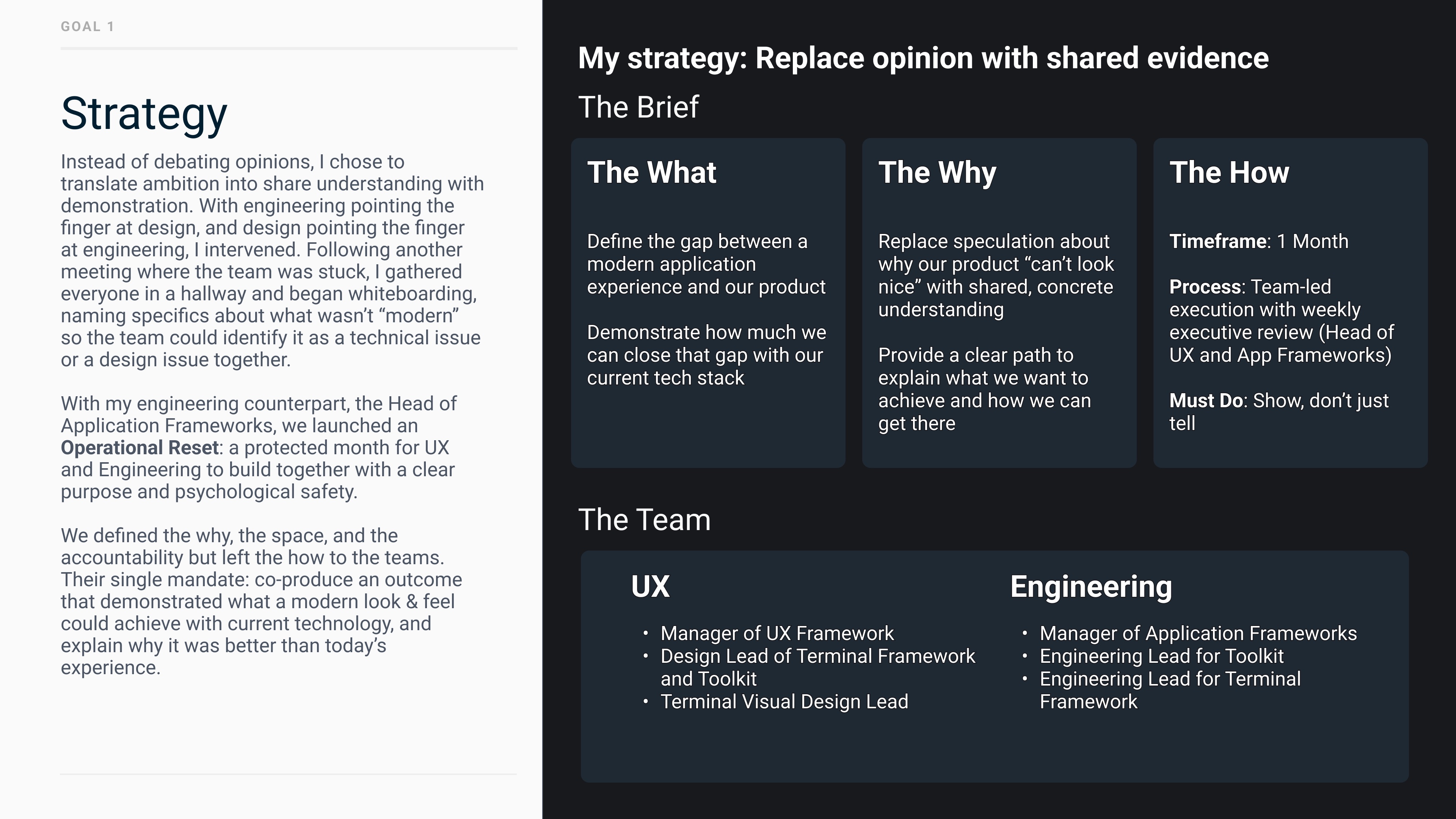
Strategy: replace opinion with shared evidence. With the Head of Application Frameworks I launched an Operational Reset, a protected month for UX and Engineering to build together. The brief covered the what, the why, and the how (1 month, team-led with weekly executive review, show don’t tell), with a joint UX and Engineering team.

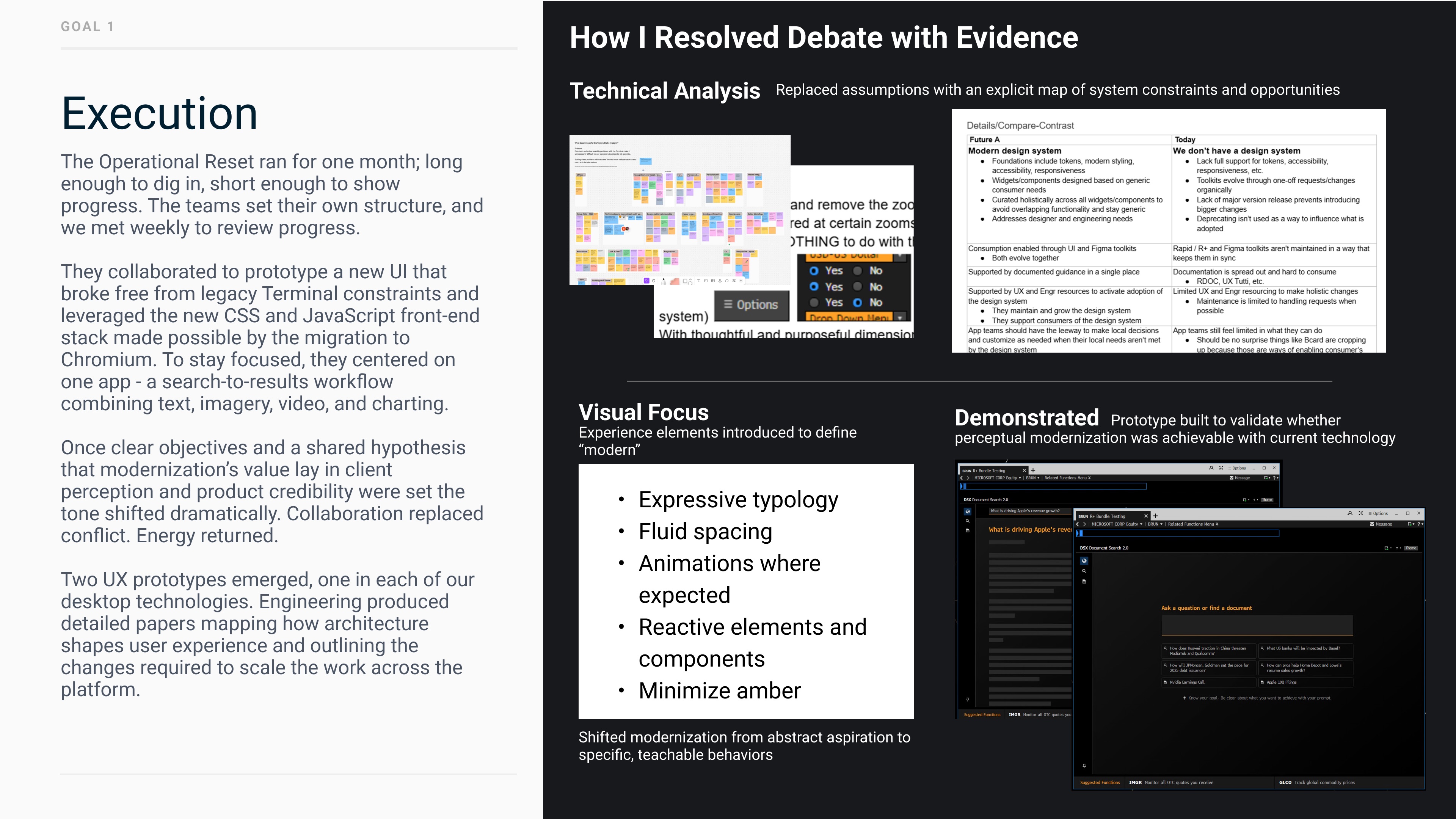
Execution: how I resolved debate with evidence. Technical analysis mapped system constraints and opportunities; a visual focus defined “modern” (expressive typography, fluid spacing, animations, reactive components, minimal amber); and a prototype of a search-to-results workflow showed perceptual modernization was achievable with current technology.

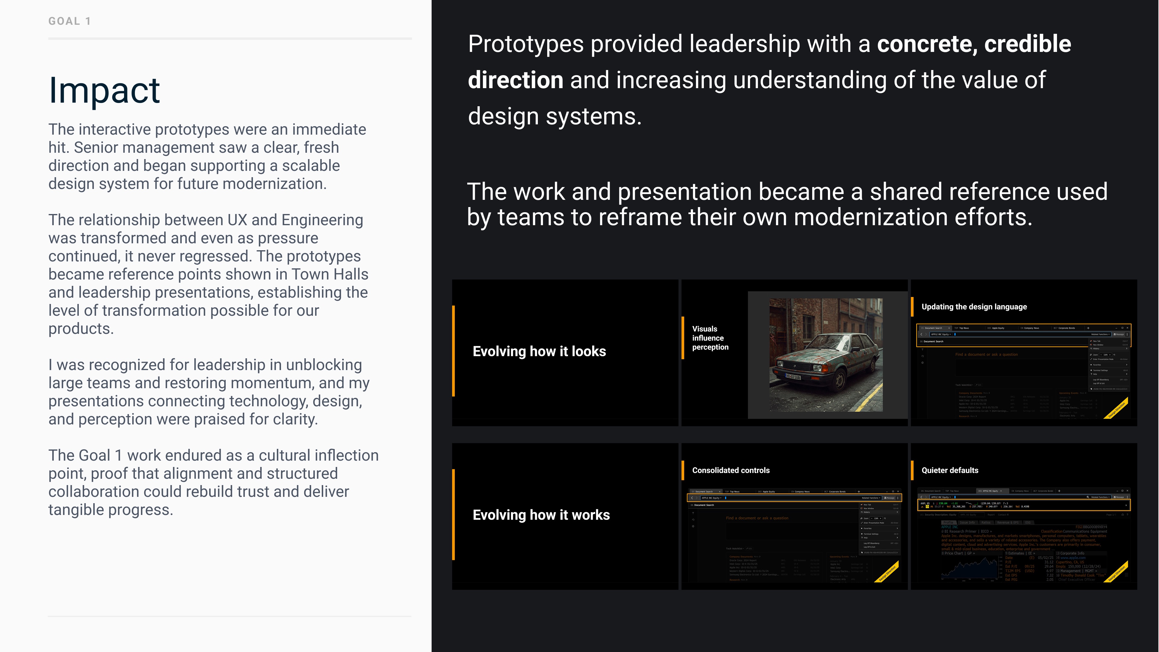
Impact: the prototypes gave leadership a concrete, credible direction and built understanding of the value of design systems. The work became a shared reference for other teams, and the UX–Engineering relationship never regressed. Shown with presentation slides on evolving how the Terminal looks and works.

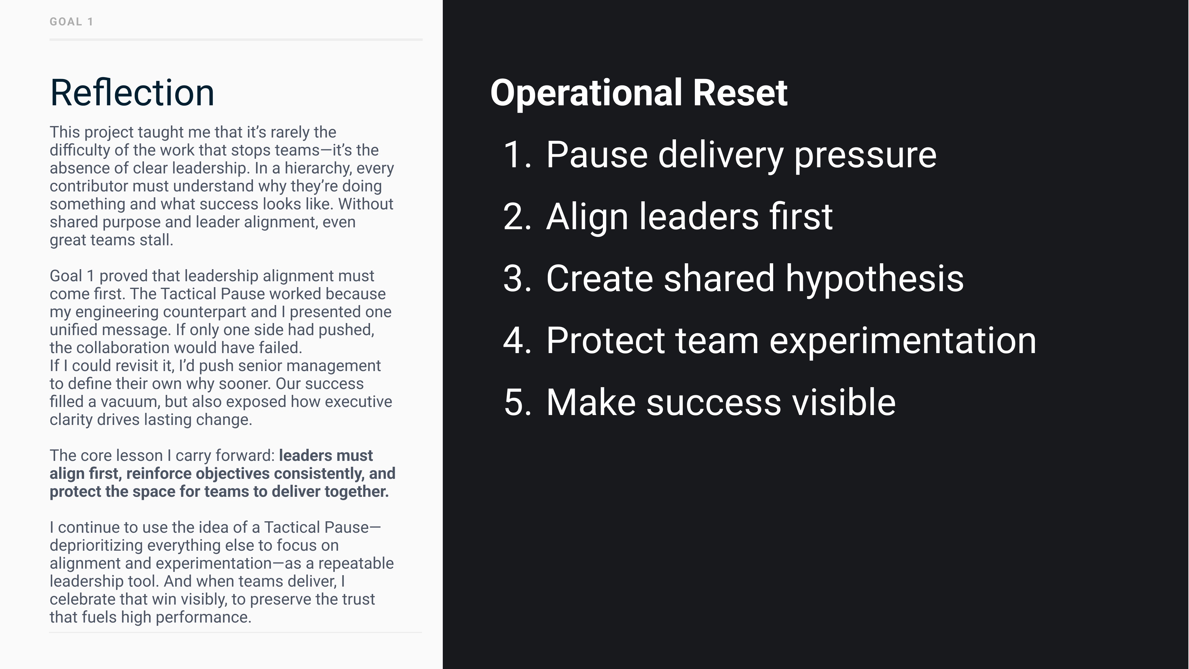
Reflection: it’s rarely the difficulty of the work that stops teams, it’s the absence of clear leadership. Leaders must align first, reinforce objectives consistently, and protect the space for teams to deliver together. The Operational Reset: pause delivery pressure, align leaders first, create a shared hypothesis, protect team experimentation, make success visible.

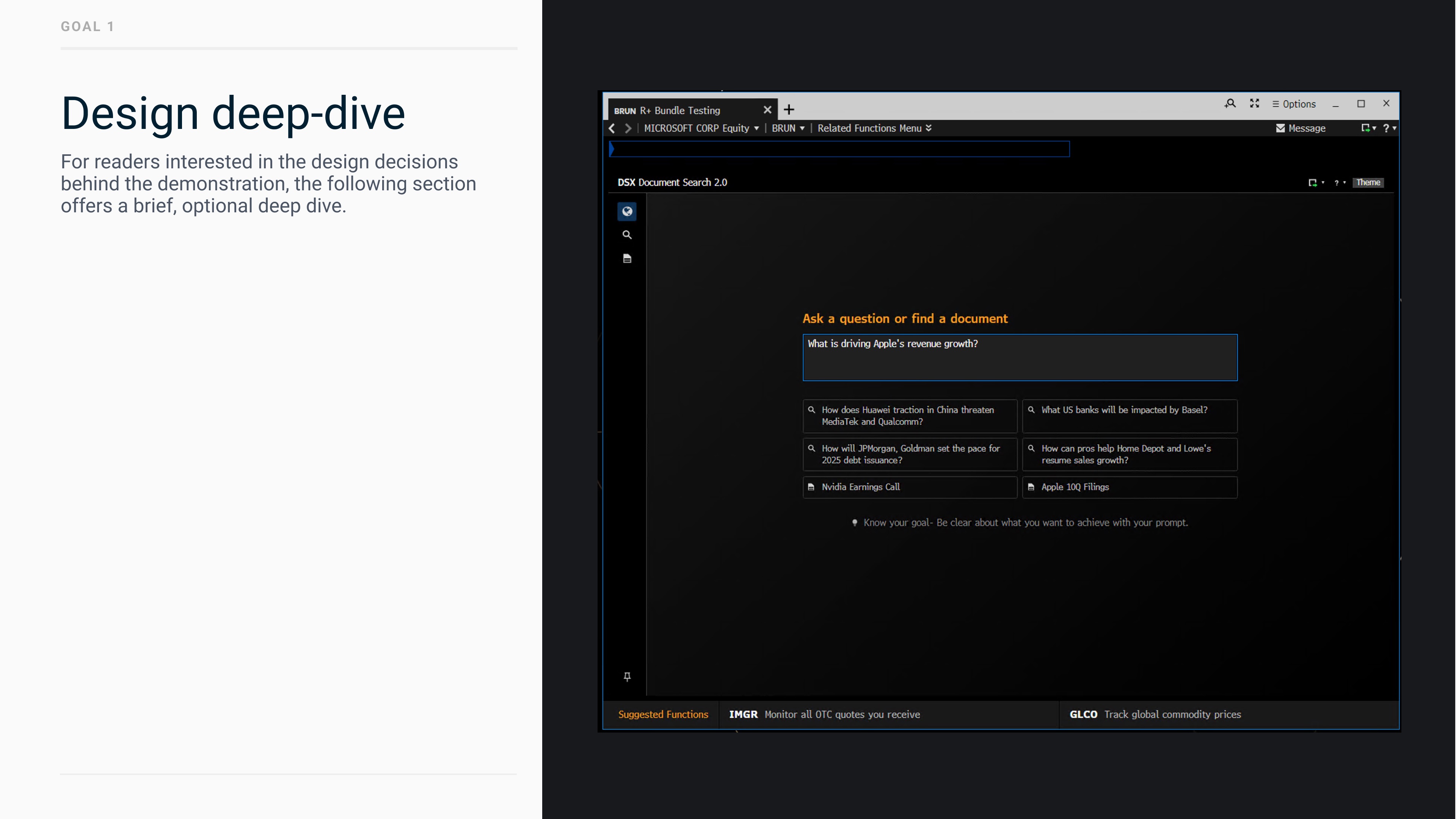
Design deep-dive: an optional look at the design decisions behind the demonstration, starting with the DSX Document Search entry page.

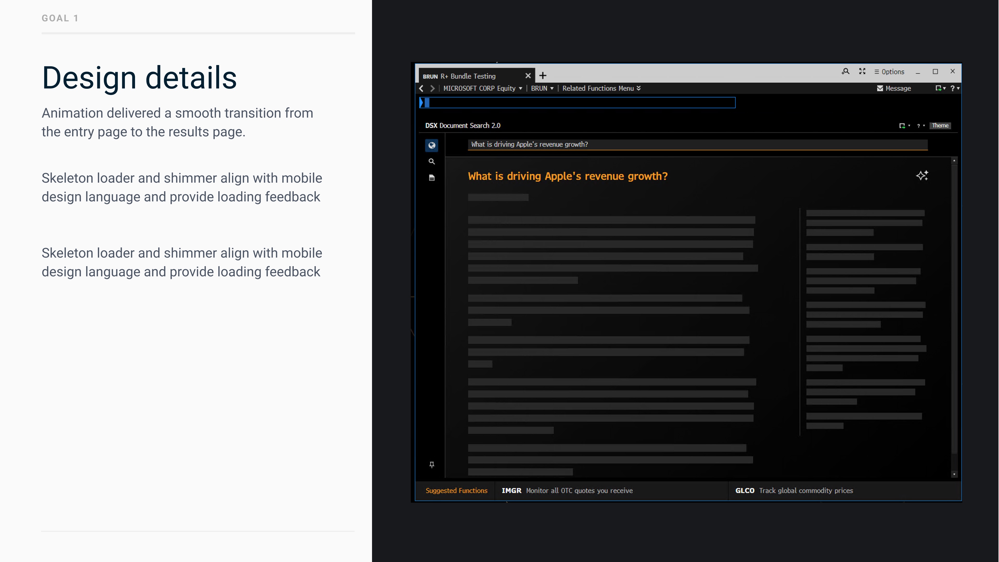
Design details: animation delivered a smooth transition from the entry page to the results page, and a skeleton loader with shimmer aligned with mobile design language and provided loading feedback.

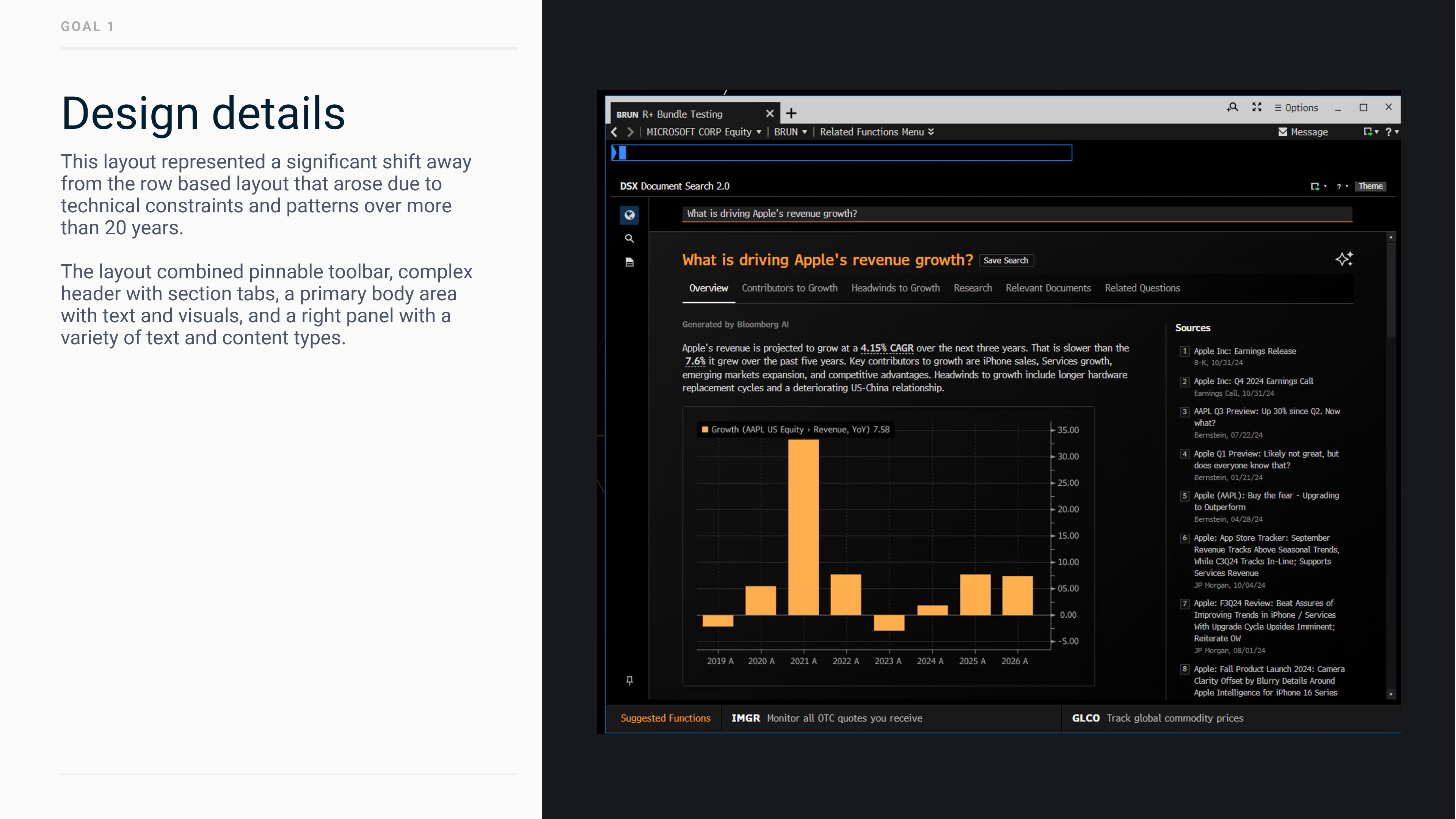
Design details: the results layout broke from the Terminal’s 20-year-old row-based layout, combining a pinnable toolbar, a header with section tabs, a body with text and charts, and a right panel of sources.

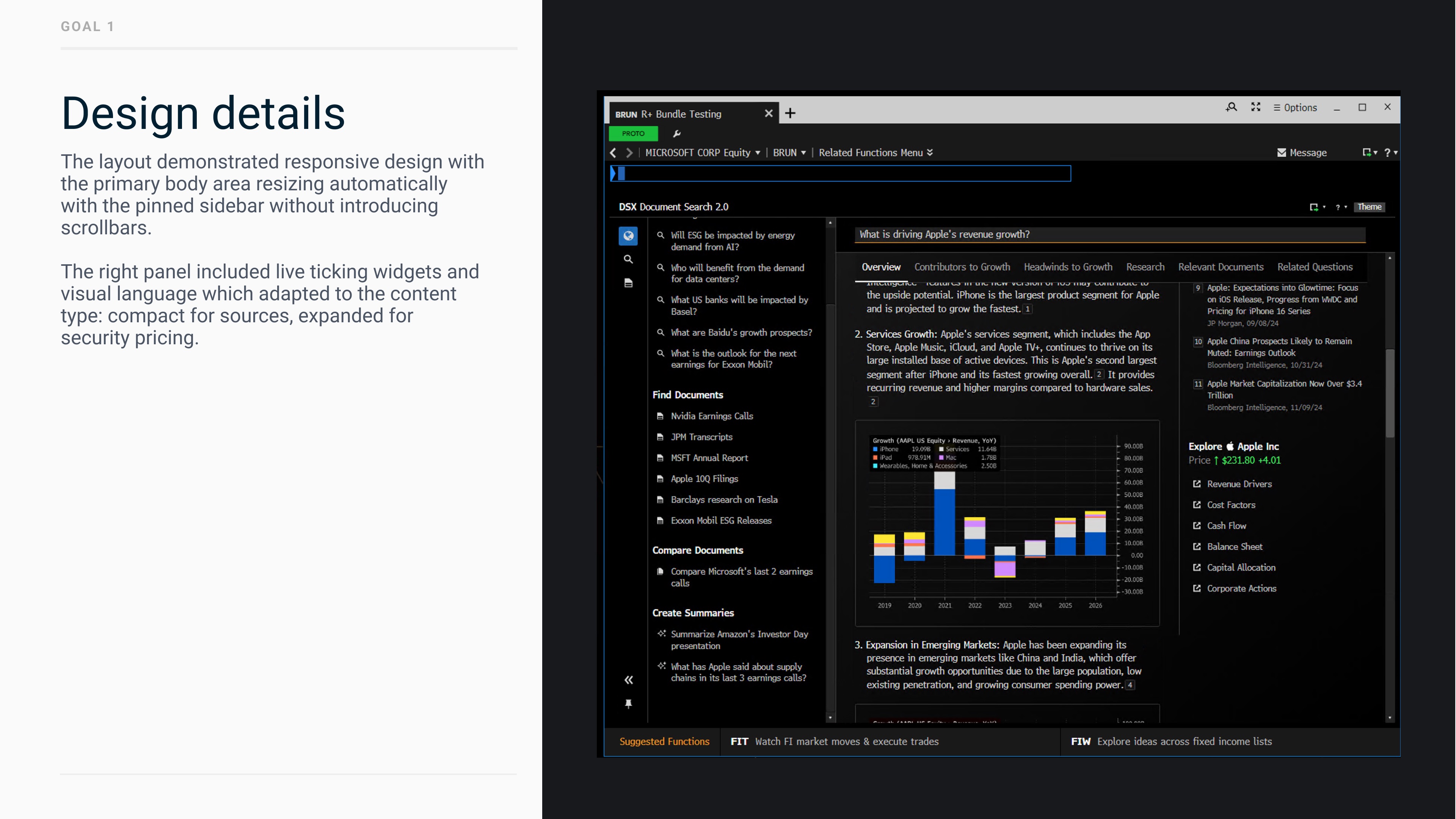
Design details: the layout was responsive, with the body resizing around the pinned sidebar without scrollbars, and a right panel with live ticking widgets that adapted to content type.

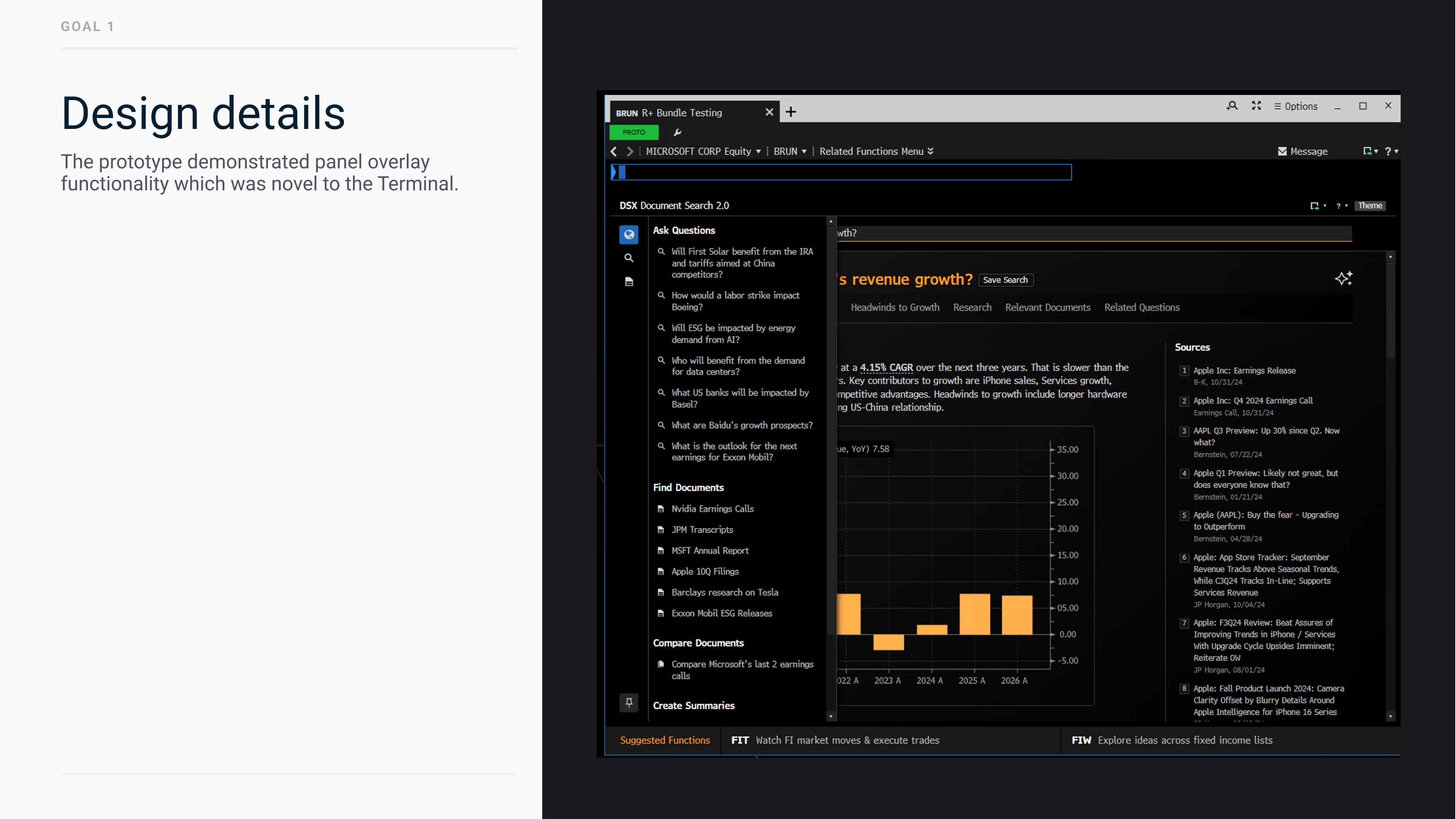
Design details: the prototype demonstrated panel overlay functionality, which was novel to the Terminal.